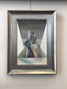
Recently I was very lucky to successfully bid on the original oil painting of the Queen of Swords from the Fountain Tarot, painted by artist Jonathan Saiz. I was motivated to win it, as an air triplicity, I mostly identify with the Queen of Swords, and I am also an art collector. So the contemporary artwork of the Fountain Tarot appeals to me and my fine art trained eye. And it took me about 12 months of stalking his experimental art auction instagram page @sowrongitssoright to get it.
I started collecting art in my 20’s while I was at Uni studying fine art, and my husband also started collecting in his 20’s, while he was studying architecture, so now we have amassed quite a collection. Actually it’s bordering on being featured on an episode of Extreme Hoarders, yet strangely when you hoard art you get to be called a ‘collector’.
When I look at this painting, with its myriad layers of subtle colours, shapes and brushstrokes, the limitations of the printing press and the size constraints of the tarot card are evident. Look at all that colour! Sadly the printing process is limited in it’s capacity to recreate the detail and scale of colour that we see with our naked eye or what we can create with paint.
Nevertheless whenever I look at artwork in a tarot card I inherently see and feel what the artist has conveyed, even on a subconscious level.
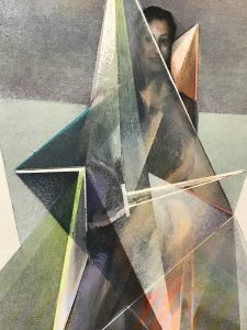
Some say that the Qi or life force of the artist is embedded into any work they create. I can see that in this painting, and in fact the whole of the Fountain Tarot deck. The Fountain Queen of Swords was modelled on Jonathan’s mother, and I can see the softness in her face and the sharpness of her protective shield. I also see a tiny baby of vulnerability and sorrow nestled into her neck. Perhaps no-one else sees exactly what I see, but what is important is what the artwork evokes in you as the reader, because that brings the magic and the art of reading.
When I look at a line or a brush stroke or a shape, I know that the artist had specific intention for creating it. An artist just won’t waste time putting it there if it has no reason to be. Does it look sharp? Soft? Jagged? Fully formed or loose? Ethereal or solid? I find that looking through the eyes of the artist acts as a springboard for me to pinpoint and link the story when I read.
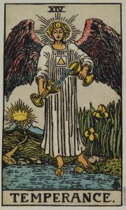
It really is amazing that even when I think I know the artwork on a card really well, symbols or small details can jump out that I haven’t noticed before. Several years ago I saw this in Pamela Colman Smith’s artwork for the Temperance card for the first time. No they aren’t just decorative folds in the top section of her robes, that is the unpronounceable Hebrew name for the divine, Yod He Vau He, read right to left, or YHVH the four worlds of fire, water, air and earth. For me, YHVH illustrates the notion that every spark of a creative idea runs through the gamut of emotion and rational thought before successfully becoming an earthly reality and when the balance of those suits, fire, water, air, and earth are out of alignment that’s where problems arise in our lives.
Colour psychology and colour vibration is also very important to me. As soon as cards are laid I can see and feel from the colour what sort of atmosphere I am looking at. Dark and gloomy, light and bright, a mixture of the two, full of action and fiery or watery and cool and passive. Colour emits vibration and evokes emotion. There is a reason the colour red, for example, is never used in a prison, because it is such a powerful colour stimulating excitement, courage and strength. Green is often used in hospitals for promoting balance, harmony and rest.
Which brings me to think about the work of artist Lady Frieda Harris and her paintings for the Aleister Crowley Thoth deck. Well I’m not even going to go there right now other than to say she was an utter genius with colour, projective geometry and interpreting Crowley’s magnitude of symbolic information. Do yourself a favour and go and read about her, and then go and read about her some more, because the complexity of her artwork, colour association and symbolic correspondences deserves some serious art appreciation.